John Cowper
Digital Graphic Designer
Graphic Designer, Lecturer & Digital Media Expert
My most recent work.
Here is a selection of my portfolio of work that I have been working on recently. This is just a selection of the work that I have undertaken for my clients, it doesn’t constitute the entire body of the work that I undertake. Please feel free to have a look and enjoy.
-
Touchbase Logo

-
Star Grill Logo

-
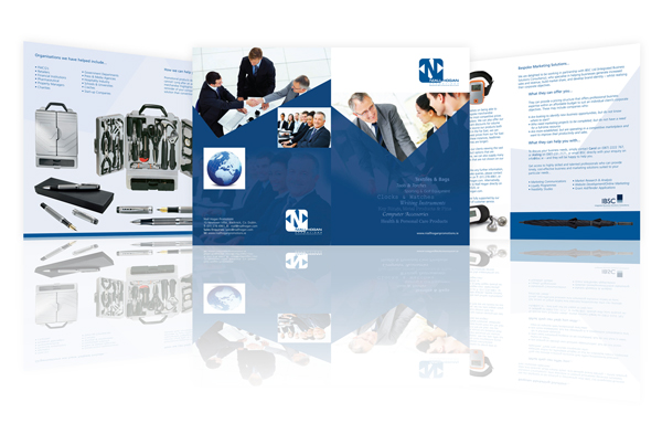
Nial Hogan Logo
-
Motorvation Logo

-
CJK Logo
-
Larchfield Park Logo

-
IBSC Logo
-
Irish Hypnosis Logo
-
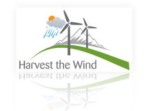
Harvest The Wind Logo
-
Dealer CRM Logo

-
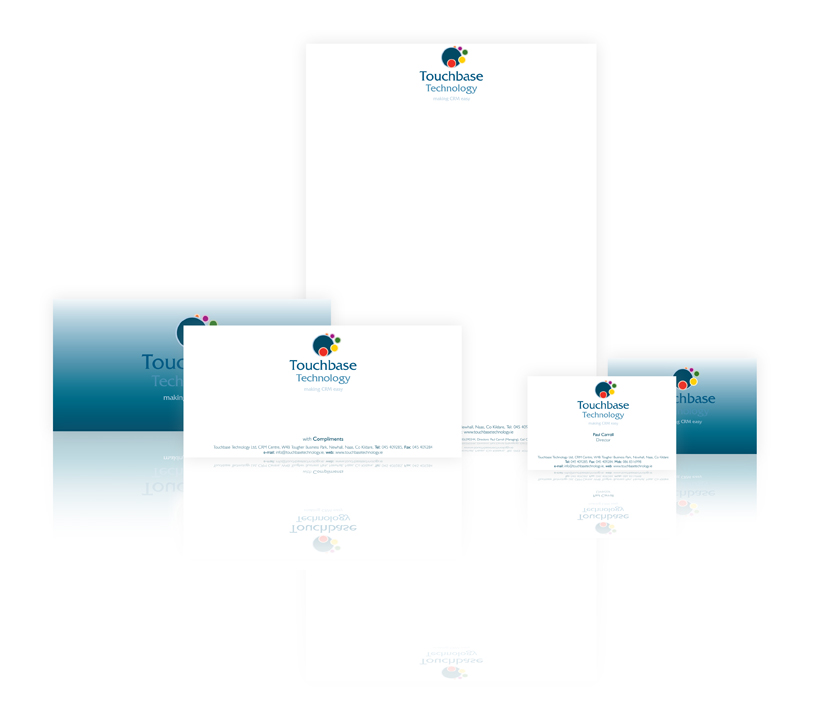
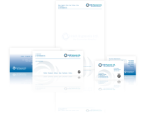
Touchbase Technology Stationery
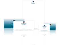
The client on this job wanted his stationery to stand out on a brilliant white Lazer Bond paper. We just used the logo on the reverse on a blue gradient.
-
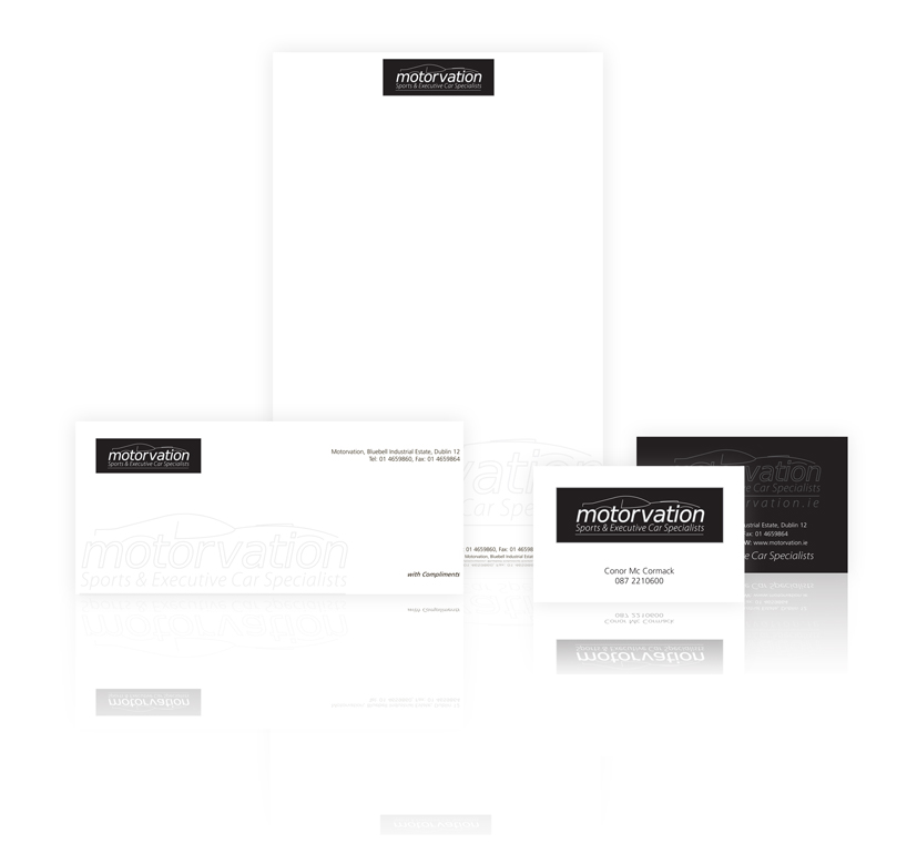
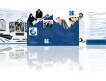
Motorvation Stationery
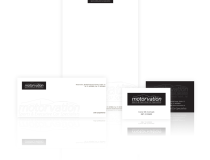
The was a really lovely job which went down with the client very well indeed. A very striking black used with tints of the black to be seen as grey. Effectively the job was printed as a one colour job. The client was very pleased with the final outcome and printed work.
-
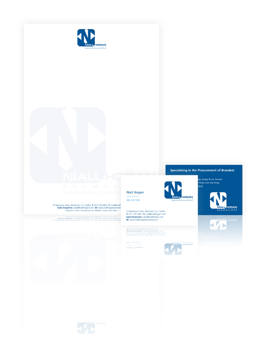
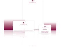
Niall Hogan Stationery
The client on this job wanted a reverse image of the logo on the rear of the business card there was not compliments slip on this job. Using the logo as a tint on the front of the letterhead went down very well with the client.
-
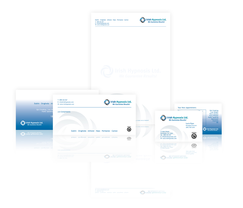
Irish Hypnosis Stationery
We decided to use the logo throughout the stationery set. The logo was enlarged and placed on the stationery with the use of corporate blue on the reverse of the card and compliments slip.
-
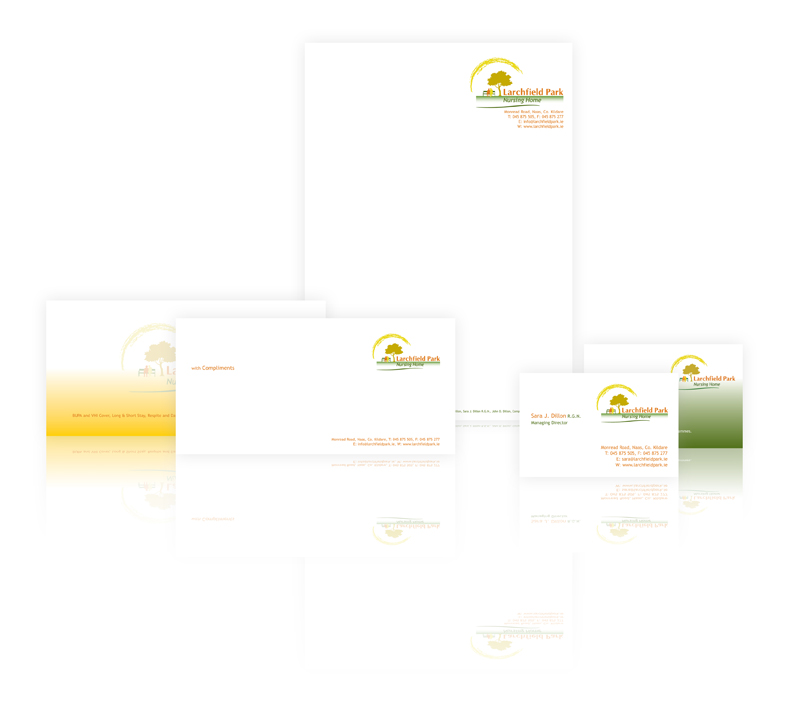
Larchfield Park Stationery
The client wanted something different on this job so we used the colours used in the logo and placed them on the reverse of both the compliment slip and the business card. The logo was toned down in colour to light tints and the effect went down very well with the client who was very […]
-
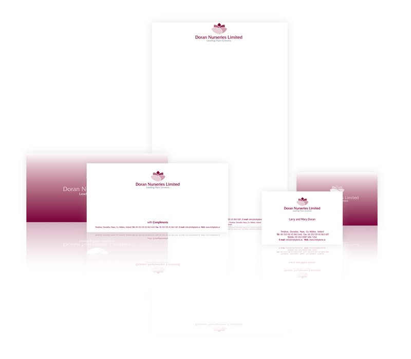
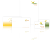
Doran Nurseries Stationery
We were approached to design a new stationery set for this client. We were not involved in the design of the logo on this stationery as this was undertaken by some other design company. We respected the design style and used the colours used in the logo to design the stationery. We think the stationery […]
-
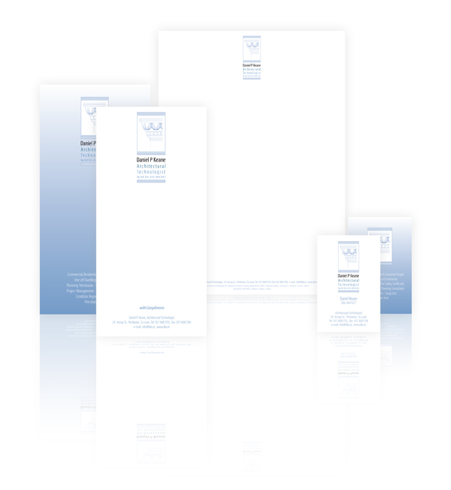
Daniel P Keane Stationery
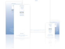
On this Job we took the client’s existing logo and improved it. The logo is portrait in orientation so we designed the business card and the compliments slip to reflect this. The final outcome was very successful and the client was really happy with the final printed stationery.
-
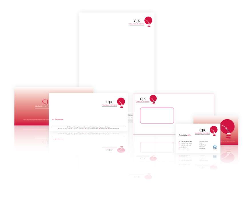
CJK-Stationery

The client on this job wanted a very straight stationery set. So we created a complete stationery set comprising 5 items. These are 1. the letterhead, 2. the compliments slip, 3. the business card, 4. the continuation sheet, 5. 2 types of envelopes. We designed this stationery to compliment the logo and placed the logo […]
-
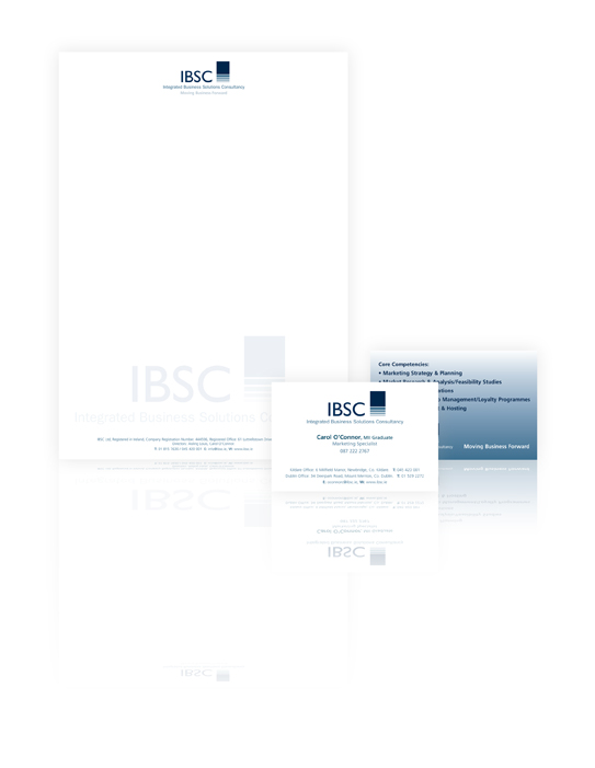
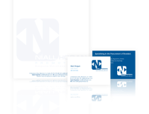
IBSC Stationery
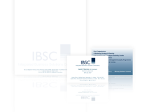
The client on this job really loved our previous work using tints and shade of logos onto the letterheads. We designed this stationery to compliment the logo in every way and use it on the letterhead in particular. We used all the colours and lightened them down to give a tinted effect. This was used […]
-
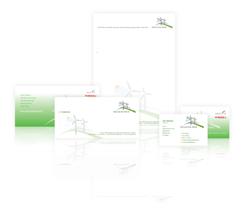
Harvest The Wind Stationery
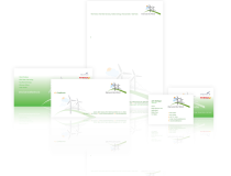
We designed this stationery to compliment the logo in every way. We used all the colours and lightened them down to give a tinted effect. This was used to re-enforce the logo on the stationery as if it were a watermark.
-
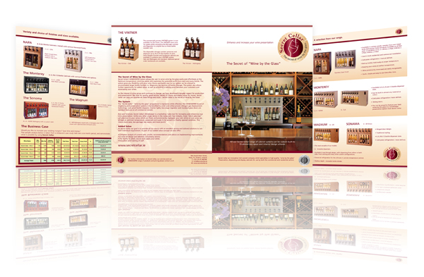
Secret Cellar Brochure
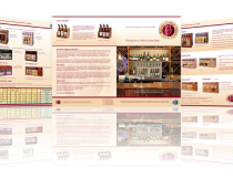
Secret Cellar is a new concept and this brochure was design to bring all the parts together, the wine and the wine chilling concept.
-
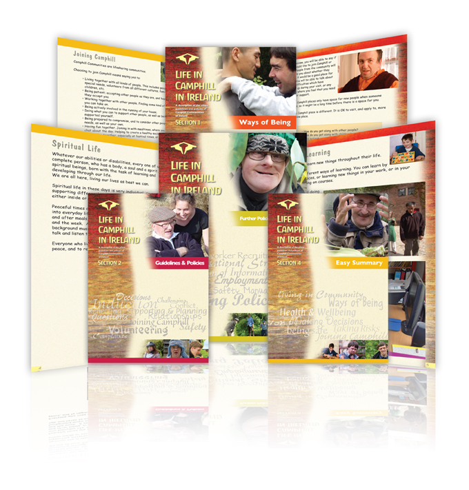
Camphill Brochures
Camphill commissioned me to design a series of brochures to reveal their way of life, concepts, philosophy, culture, accounts, attitudes and the general way of life that exists at Camphill.
-
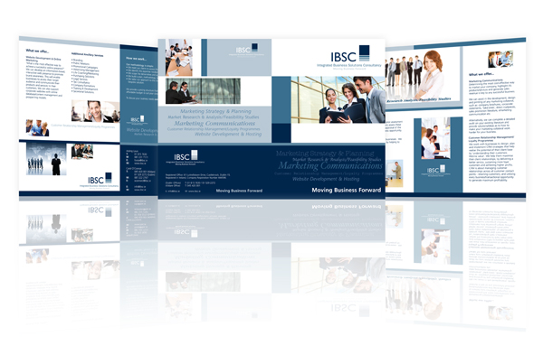
IBSC Brochure
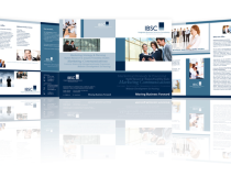
IBSC commissioned me to design this brochure for then to give them a sophisticated, corporate design style that they could use in the corporate world anywhere, Dublin, London, New York. The design of the website is also very similar to the brochure design.
-
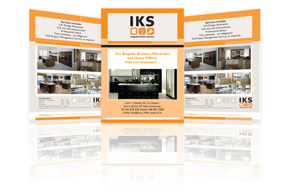
IKS Leaflet
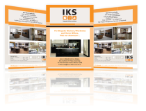
I based this design simply of the design of the website using the same structure and form and colours with familiar fonts.
-
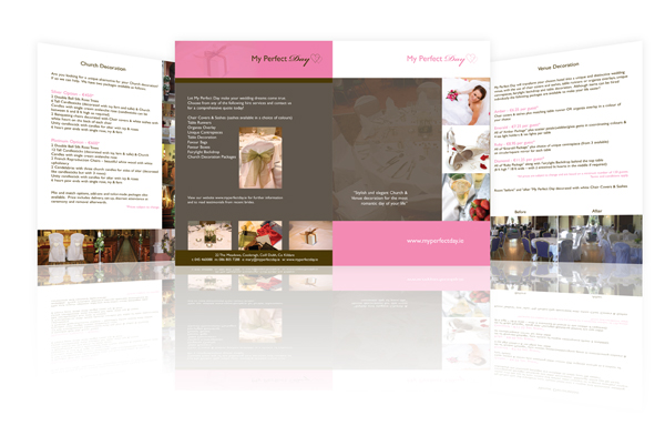
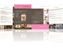
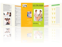
My Perfect Day Brochure

My Perfect Day was based on existing ideas that the client had and expressed. This was a simply design which the client liked very much, a very simple but effective design.
-
Thornbyhall Leaflet
This Thornbyhall leafet was based on the website, the colours used and an old worldly feel. A sort of picture frame a window into a past bygone era.
-
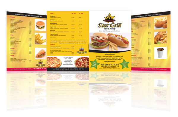
Star Grill Leaflet
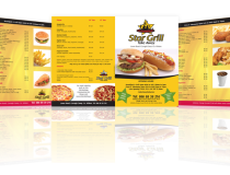
Star Grill is a simple design for a fast food take away.
-
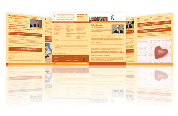
Schizopherina Brochure
Schizopherina Ireland commissioned this brochure, I used the main colour orange throughout as it exists in the logo.
-
Niall Hogan Brochure
This brochure was based on principle on the same design as IBSC as requested by the client. Hense the same use of colours, tints and tones.
-
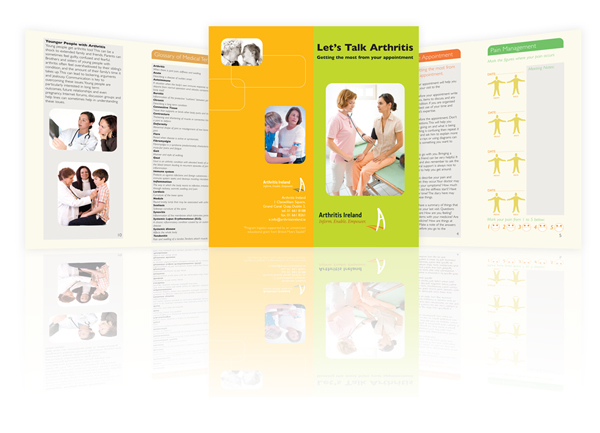
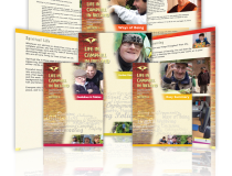
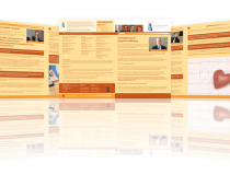
Arthritis Ireland Booklet
This was a lovely job to do, a booklet a third the size of an A4 sheet in size. Arthritis Ireland commissioned this booklet style brochure to fit into holders in recepition rooms, hospitals and surgeries.
-
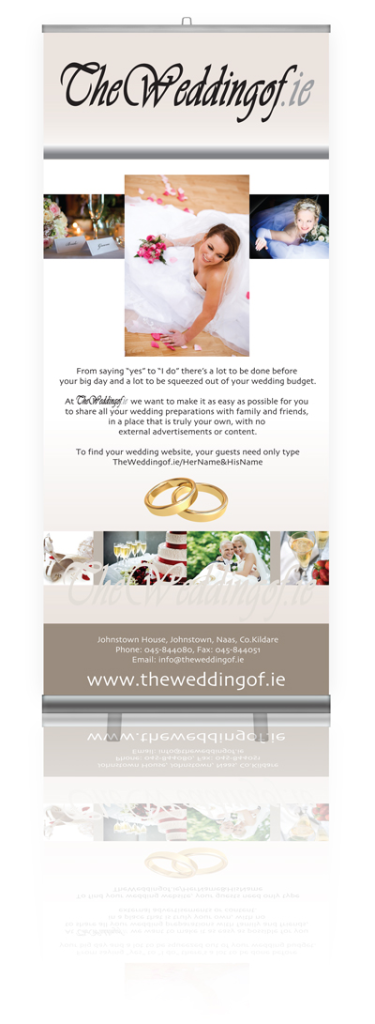
The Wedding Of Roll Up Banner

The Wedding Of .ie is a great concept and the banner was designed to appeal to woman more than men.
-
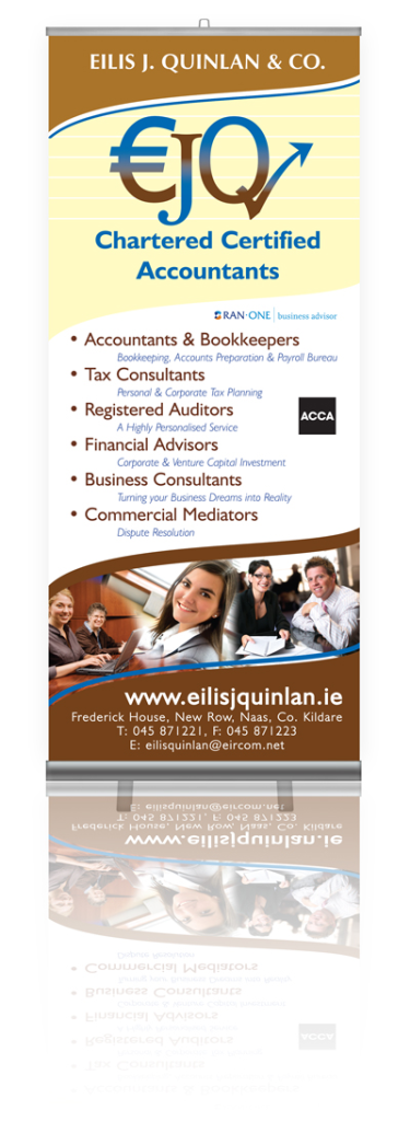
Eilis J Quinlan Roll Up Banner

Eilis J Quinlan & Co. Accountant commissioned us to design a rol up banner that would really stand out at an Exhibition Hall or Event anywhere in the world.
-
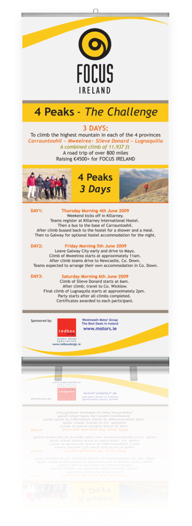
Focus Ireland Banner
We designed this banner free of charge as part of our sponsership of these events.
-
L.I.F.E Banner

The Leinster Institute commissioned us to design a banner to reflect the Academic activities and services of L.I.F.E. We also added in a logo which we also designed.
-
Johnstown Business Centre Banner
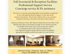
This roll up banner was designed to advertise the facilities at the Johnstown Business Centre. An internal banner to be used only in doors.
-
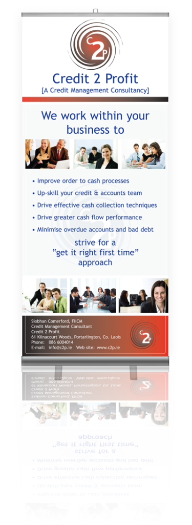
Credit To Profit Banner

We designed this website to reflect the design of the website so that there was a continuity flowing throught the corpaorate design fo the company.
-
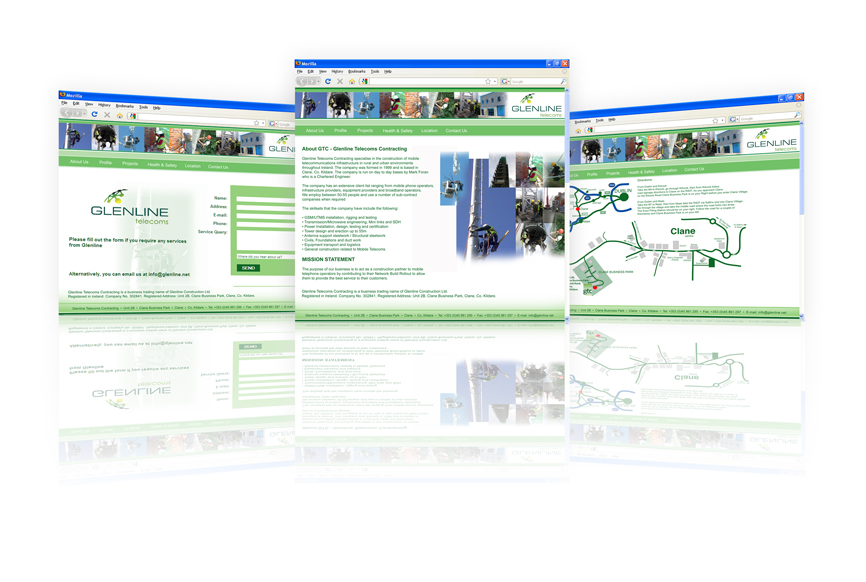
Glenline Website
Glenline Telecoms commissioned this site to reflect an open bright feeling. They wanted the green colour of the company logo to be predominant throughout. The site is a (cms) site, a Content managed Site where Glenline can alter and change all of the content of this site in easy steps.
-
Hassetts Website
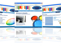
This website was commissioned to reflect the variety of colours that Hassetts Painting Contractors use for a number of their clients. The design is supposed to minic a painting reference swatch, hence the use of coloured blocks within the site.
-
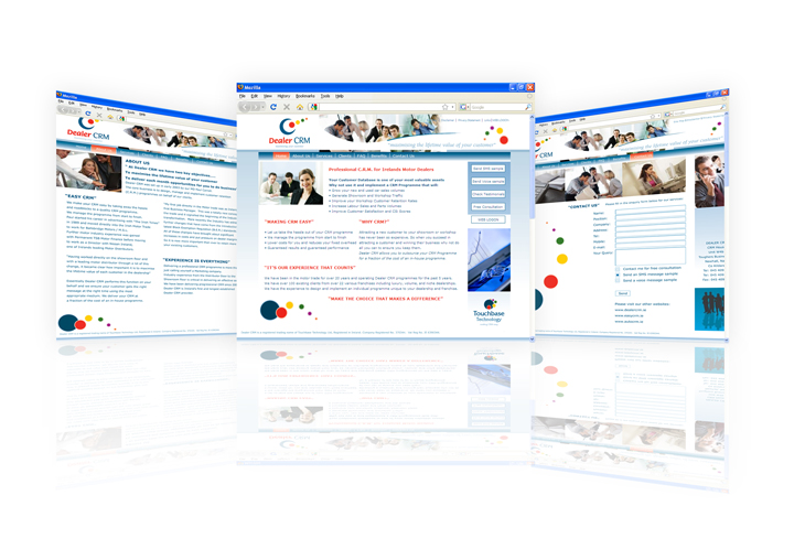
DealerCRM Website
DealerCRM, I designed this site and the logo and based the design and the colour of the site on the logo. The design gives us a modern and slick feel to the site where the colour use is subtle and is easy on the eye.
-
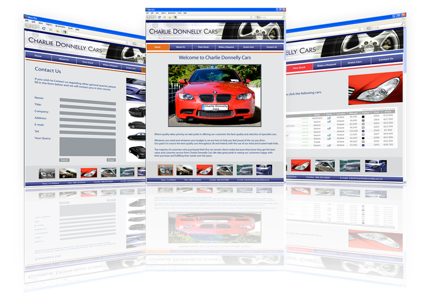
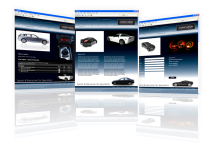
Charliedonnellycars Website
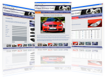
Charliedonnellycars features the use of an x-fade on the home page, where some great images fade into one another. This is eaxctly what the client requested as this reveals the type of cars they sell.
-
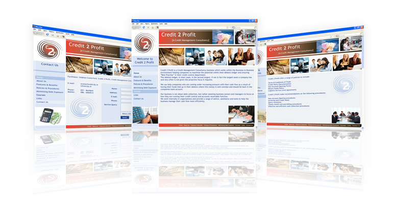
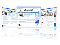
Credit 2 Profit Website

C2P is a very simple design that works very well for the client. It uses a vertical navigation bar to the left.
-
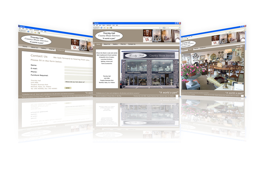
Thornbyhall Website
Thornbyhall is an amazing store full of beautiful things! This is true, the site uses a lightbox gallery style to zoom in on the thumbnail images in the gallery section.
-
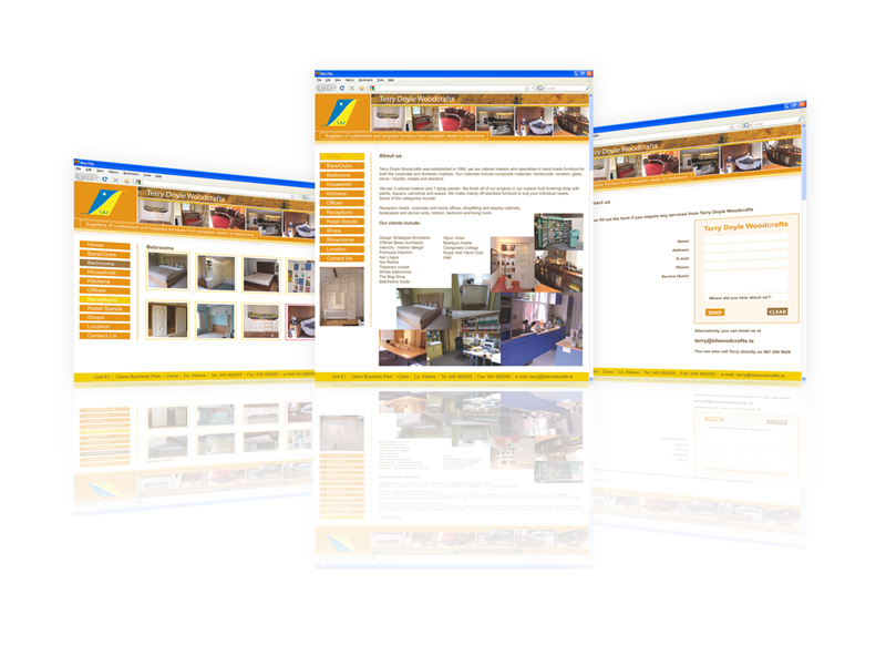
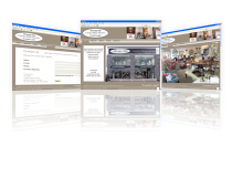
Tdwoodcraft Website
Tdwoodcrafts was designed to reveal all the splendure of Terry Doyle’s woodcrafted furniture. It features a super selection of gallerys that show up his work perfectly.
-
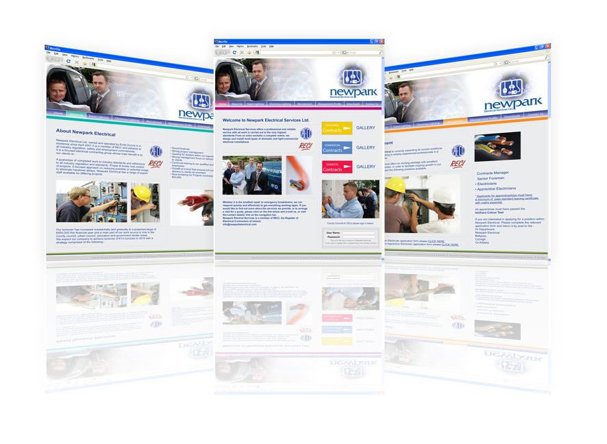
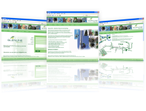
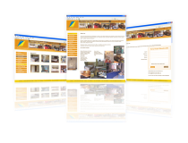
Newpark Electrical Website
This site is one of the only Electrical Contracting websites out there and the client is very proud of this. The design of this website mimics the electrical wiring involved in almost all electrical work.
-
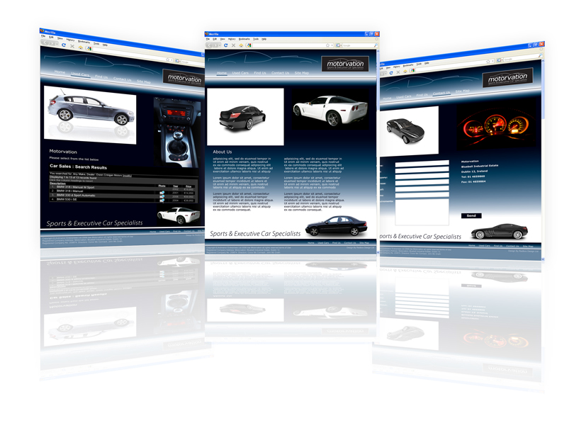
Motorvation Website
The Motorvation site was designed to reflect an up market, slick and expensive client base. The client wanted a completely new design seperate to the old design that set the site apart from any of Motorvation’s competitors.
-
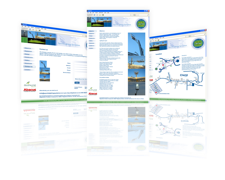
Sportslightingsystems Website
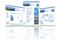
We designed the Sportslightingsystems website to really home in on the gallery as these are really what makes this site. We tried to make this site as simple as possible as well as being easy to use. This site is also a (CMS) Content Managed Site.